
 In the last two posts, I explained how you can use your word processing application’s Styles feature to help make formatting your document more efficient, consistent and professional looking. But the Styles feature can do more than just apply several formatting choices to your text with one click. Today, I’ll explain how you can use Styles while writing to make it even more efficient.
Following Style
Microsoft Word allows you to specify the style for the following paragraph. Unfortunately, this only works when you specify the Style first, then type it and hit Enter/Return. It doesn’t change the Style of something that’s already in the file.
When you design your sub-heading, for example, you could specify the following paragraph to be your First paragraph. The following style for your First paragraph should be Body text.
Shortcut keys
Specify a shortcut key for each style, so that you don’t have to move the mouse to select your Styles from the menu. I use Opt-b or Alt-b for Body text, -F for First paragraph, -a, -b etc for chapter headings and sub-headings, and so on.
You can save all these styles in a template in Word. While this seems unlikely, you can start writing your book in this template. You could write the title of your first chapter, and before hitting Enter or Return, hit Alt-a to set it in your Chapter head style. When you do hit Enter, the next paragraph will already be set up as First paragraph style. Write that, and then the next paragraph will automagically be in your Body text style.
However, most likely you will write your book before you decide on the graphic design and format. Still, with these Styles set up and with shortcut keys, you can quickly go through the file. Because Styles in most word processing applications apply to paragraphs, you don’t have to select the whole paragraph. Just place the cursor anywhere in the line, hit the shortcut key, and voila!
On the other hand, you can select a series of paragraphs and set them all in Body text with one keystroke. (Okay, an option-keystroke).

The Styles you’ll need
When you write a long document, such as a proposal, a report or a book, you’ll need at least these styles:
- Body text – the basic text for most of the document. This should be an easily readable font. See the earlier post about the type characteristics you have to decide on, but also, set up the Paragraph characteristics. Decide whether you want to double-space paragraphs (good for reports and other corporate documents) or to indent the first line of every paragraph (standard for fiction and non-fiction books). Never do both.
Tip: Add some extra space between each line. This is the word processor’s equivalent of what typesetters called leading (pronounced “ledding.”) This will make your text easier and more inviting to read. - First paragraph – the first paragraph in each chapter, as well as after each heading or subheading, or after each sub-chapter break. If your body text has an indented first line for each paragraph, the first paragraph should not be indented.
- Chapter heading or title
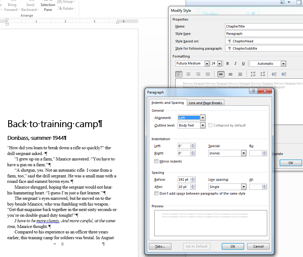
The window for setting up spacing for your Styles. Tip: Put more space above every heading and subheading than below it. Use the Spacing, Before setting. For example, for my books, I like to have the first paragraph of each chapter start about half-way down the page. For a 5 x 8-inch page, that means three and a half inches, or 252 typesetter’s points, below the top margin. In that space, I put the chapter title and subtitle, which in my case are 24 points and 14 points, respectively. After the main title I put 10 points of space, and after the subtitle, 12 points (one pica), equivalent to one line of body text. That’s a total of 60 points. That leaves 192 points of space, so in the Chapter title Style window, I can set 192 points of spacing before the heading.
- Chapter sub-heading or section heading—not always necessary for fiction, but non-fiction such as reports, proposals and textbooks benefit from multiple subheading levels as signposts for your organization. However, you rarely need more than three levels of subheadings.
- Visual headers—These display the titles of your tables, graphs and pictures, if any.
- Captions—the explanatory text below tables, graphs and pictures. It should be smaller than your body text, and ideally in a different typeface, as well.
- Tables—If your document has a lot of tables or graphs, you will need a text style for labels, column and row headings and so on. This is where you’ll benefit most from the way that Styles enforce consistency.
- Header—the text in the top margin of each page
- Footer—the text in the bottom margin of each page
Tip 1: Header and footer Styles should be smaller than your body text. You can also use a distinct typeface; for example, if your body text is Times or another serif font, use a sans-serif like Helvetica or Avant Garde for your headers and footers. If it’s a good deal smaller than the body text, you could also use boldface. However, I don’t recommend italics for a page header or footer. They’re usually too hard to read at small sizes on a screen.
Tip 2: Word has a large number of pre-set styles for headers and footers that include folios (page numbers). These are useful for corporate documents. Choose a simple one. You don’t want to distract your readers from the body text.
For fiction, stay with very simple folios. A number will do.
Explore
There is a lot more to Styles. Explore the options and tell me if you discover other useful tips.